
A deeper look at income trends reveals some positive findings.
Is the middle class in danger? On social media and in the news, Americans regularly hear that the middle class has shrunk, been hollowed out, or is disappearing. These claims can be tricky to evaluate because there is no agreed-upon way to define the middle class. Should it be defined in terms of a fixed standard of living, so that if everyone gets richer, the middle class gets smaller while better-off categories — the upper-middle class, for instance — grow larger? Or should we think of the middle class as “the middle” regardless of how poor or rich America is? Viewed this way, if everyone’s incomes double, the middle class remains the same size.
Defining the middle class these two different ways — using absolute or relative thresholds — can lead to different assessments of how the middle class is doing. Claims that it is doing poorly invariably rely on relative thresholds. It’s how the Pew Research Center could claim a decade ago that the middle class had “hollowed out,” with fewer families in the middle, more who were poorer than middle class, and more who were richer. It’s also how Pew could say that metropolitan New York City’s middle class made up less than half the population and how a recent Chicago magazine article could fret that that city’s middle class is “disappearing.”
Relative class standing matters in some contexts. If the cars that the richest Americans drive or the houses they buy are sufficiently luxurious that resentment builds among everyone else, a middle class that is better off in absolute terms might be considered worse off in relative terms. If the entry point to the middle class is pegged to what the typical family makes, the middle class might shrink if the median family’s income increases more than incomes of families lower down, raising the threshold for entry to the middle class faster than income grows among those trying to join or to stay in it.
But these are stories about rising inequality, not falling living standards. The middle class shrinks in the latest Pew analyses, despite the fact that the middle class enjoyed a 60% increase in income. The lower-income categories in the Chicago study also grew but saw large increases in purchasing power. It is usually worth analyzing living standards and inequality separately, so that negative characterizations do not give the impression that families are worse off in an absolute sense.
In a recent paper I wrote with Steve Rose, we set class thresholds so that they remained constant over time in terms of living standards, rising only with inflation. That means “middle-class” incomes buy goods and services affording the same level of satisfaction in every year. If everyone’s inflation-adjusted income increases by 50%, relative thresholds will show a stable middle class, because it now requires 50% more income to enter it. Our absolute thresholds will show that more people make enough to reach the middle class but also that more make too much to stay in the middle class.
We found that the “core” middle class shrunk between 1979 and 2024, but only because families became richer. The share of families poorer than the core middle class also shrunk. In contrast, the share who were in the upper-middle class rose from 10% to 31%.
Subsequently, I reanalyzed the Chicago data and found that using absolute class thresholds, the disappearance of the middle class since 1970 is a happy outcome of everyone getting richer. The share of Chicagoans living in communities poorer than “middle income” fell between 1970 and 2024, as did the share who were in “middle income” communities. The share who were in “high income” or “very high income” communities rose from 7% to 48%.
Designations such as “middle class,” “poor” or “high income” based on thresholds are difficult to interpret without a reference point. Nevertheless, when everyone sees real (inflation-adjusted) income growth, that progress will be apparent wherever one draws class thresholds, so long as they are absolute ones.
That brings us to a recent report on New York City living standards by the Urban Institute. That report determined that 62% of New Yorkers are “economically insecure,” based on their falling below “true cost of living” thresholds set by the Urban Institute. Those thresholds “[capture] costs associated with housing, food, health care, child care, transportation, technology, taxes, student debt, caring for people with disabilities, savings, and miscellaneous costs for items such as clothing, personal hygiene, and cleaning products.” But one could draw a different set of thresholds and find some other percentage of city residents are insecure. One recent analysis absurdly suggested that the poverty line in America should be set at $140,000, which, unsurprisingly, produces a much higher poverty rate than the official statistics do, since they set poverty thresholds much lower. How to assess any rate requires something to compare it against.
To illustrate these points, I conducted analyses of New York City building off the Chicago ones I conducted earlier. (See that report for detailed methods.) First, consider how New Yorkers fare between 1970 and 2024 when we define classes in relative terms. Following the approach of the University of Illinois at Chicago’s Nathalie P. Voorhees Center for Neighborhood and Community Improvement, I define five classes of communities (census tracts) in New York depending on whether their per capita income is below 60% of the metropolitan per capita income (very low income), between 60% and 80% (low income), between 80% and 120% (middle income), between 120% and 140% (high income), or above 140% (very high income). These thresholds change over time as metropolitan per capita income changes, so even if its per capita income increases significantly, a community might still fall down a class if its trajectory is outpaced by the rest of the metropolitan area.
In 1970 , 43% of New Yorkers (residents of the five boroughs) lived in low-income or very low-income communities, 43% lived in middle-income communities, and 14% lived in high income or very high income communities. By 2024 , those figures were 61%, 19%, and 20%. Thus, one finds the same hollowing out as in Chicago — the same disappearing middle class while more communities become poorer or richer than middle class. In fact, New Yorkers become more concentrated in very low-income and very high-income tracts. The maps display this as the falling number of beige tracts over time and the rising number of red-orange and dark blue tracts.
Class definitions are based on percentages of the metropolitan area per capita income in either 1970 or 2024: very low income (under 60% of the metro average individual income), low income (60-80% of the metro average), middle income (80-120% of the metro average), high income (120-140% of the metro average), very high income (above 140% of the metro average). The metropolitan area per capita income was $34,311 in 1970 and $57,081 in 2024 (both in 2025 dollars). “1970” technically refers to 1969, while “2024” technically refers to 2020-24. For full methodological details, see this analysis.
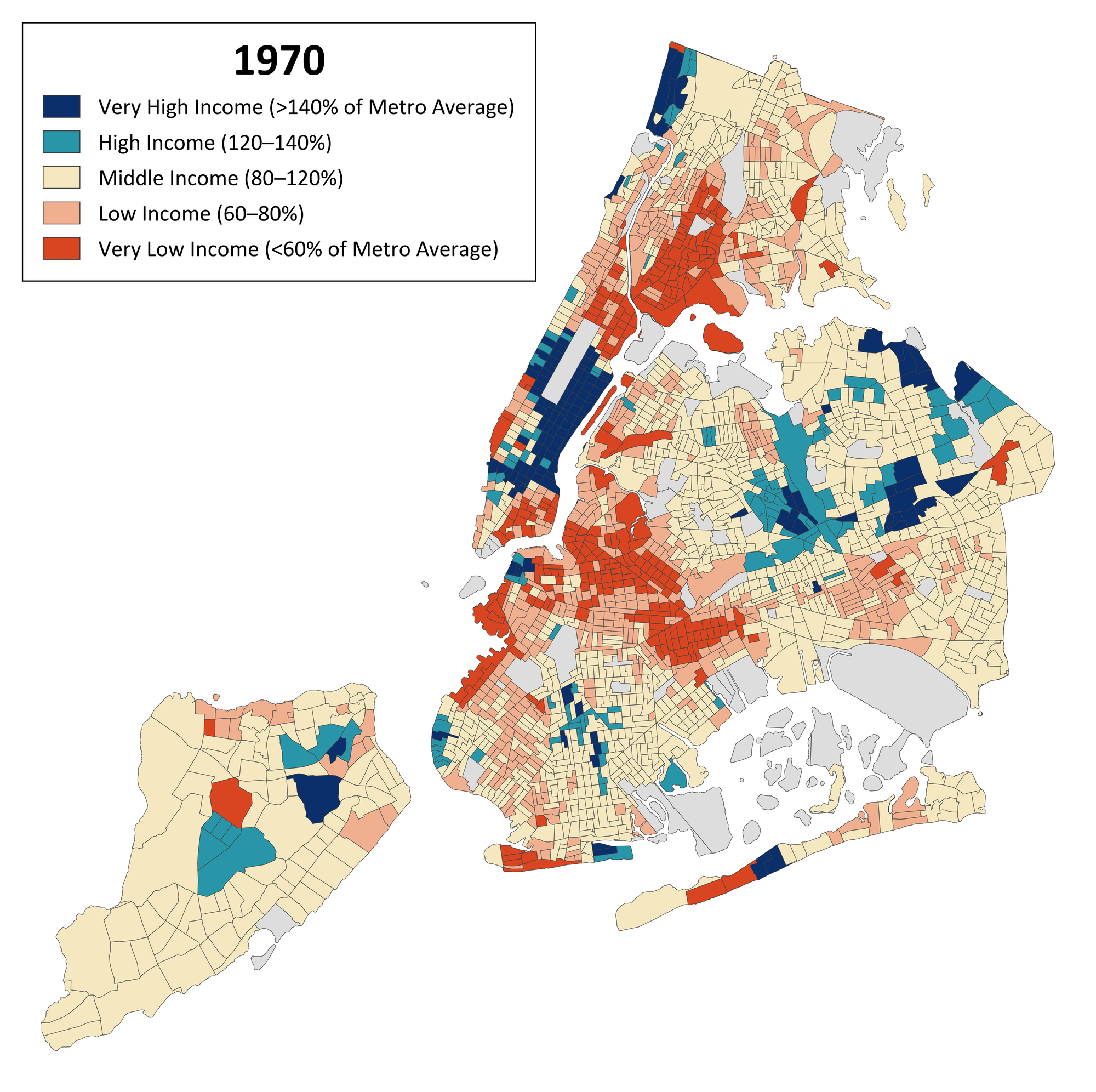
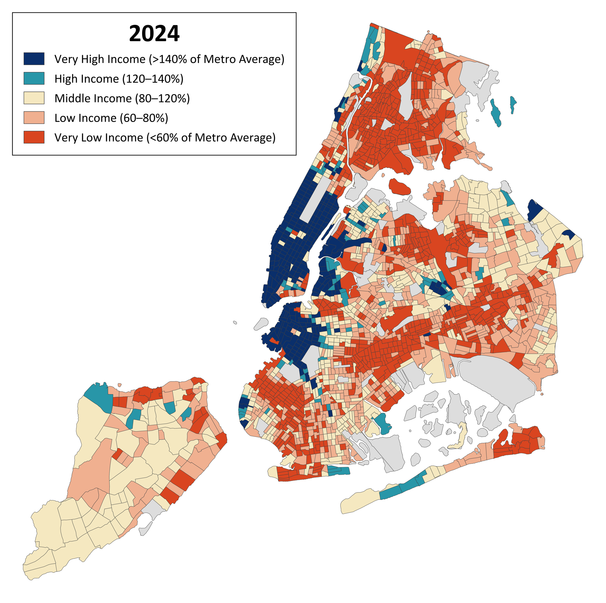
New York City census tracts by income class, 1970 and 2024, using relative class thresholds. Shading ranges from red/orange (very low income, or under 60% of the metro average individual income) to salmon (low income, or 60-80% of the metro average) to beige (middle income, or 80-120% of the metro average) to teal (high income, or 120-140% of the metro average) to dark blue (very high income, above 140% of the metro average). Unpopulated tracts are shown as grey. For full methodological details, see this analysis.
How we view the state of New York City’s middle class changes markedly, however, if we hold class thresholds fixed over time. In the first set of analyses, a middle-income tract in 1970 had per capita income between $27,449 and $41,173 (2025 dollars), while the thresholds in 2024 were $45,665 and $68,498. For the next analyses, I began with the 1970 thresholds but then kept them constant in terms of purchasing power over time.
Looking through this lens, we can see clearly that the entire distribution of New Yorkers moved up. The share living in communities that were poorer than middle-income fell in half, from 43% to 21%. The share living in middle-income communities declined from 43% to 33%. But the share in high-income or very high-income communities rose from 14% to 46%. The maps show a decisive shift to dark blue.
Class definitions are based on percentages of the metropolitan area per capita income in 1970: very low income (under 60% of the metro average individual income), low income (60-80% of the metro average), middle income (80-120% of the metro average), high income (120-140% of the metro average), very high income (above 140% of the metro average). The metropolitan area per capita income was $34,311 in 1970 (in 2025 dollars). “1970” technically refers to 1969, while “2024” technically refers to 2020-24. For full methodological details, see this analysis.

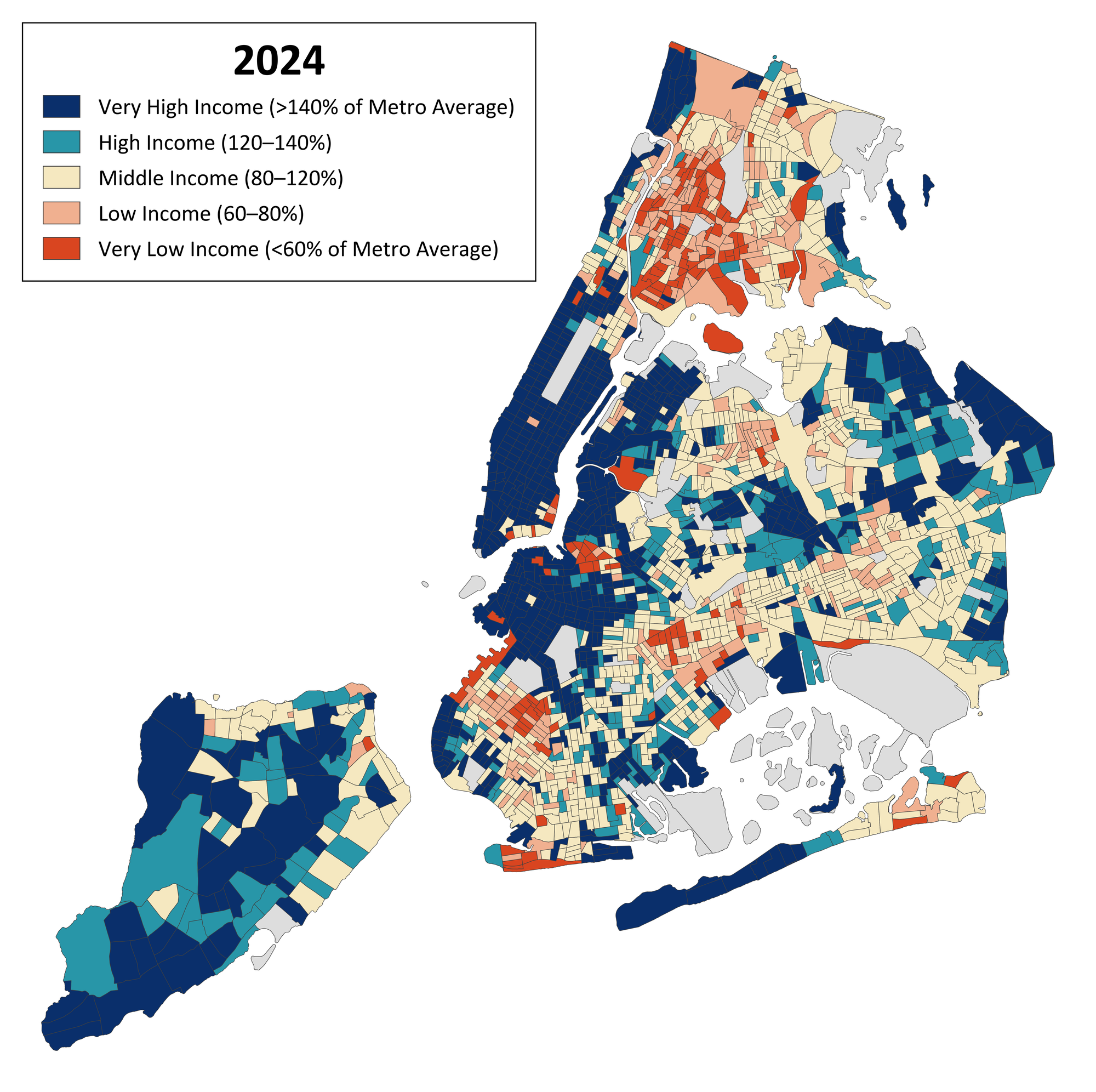
New York City census tracts by income class, 1970 and 2024, using absolute class thresholds. Shading ranges from red/orange (very low income, or under 60% of the 1970 metro average individual income) to salmon (low income, or 60-80% of the metro average) to beige (middle income, or 80-120% of the metro average) to teal (high income, or 120-140% of the metro average) to dark blue (very high income, above 140% of the metro average). Unpopulated tracts are shown as grey. For full methodological details, see this analysis.
So if we want to talk about a disappearing middle class, we should start by noting that the income distribution in New York City has shifted upward, leaving fewer people with living standards as low as was typical in 1970. That’s the kind of disappearance we can all get behind.
How do these results square with the Urban Institute report claiming that 62% of New Yorkers are economically insecure? What the report actually finds is that 62% of families had resources (essentially, incomes) below the designated cost threshold for their family type. The share deemed insecure depends heavily on how the thresholds are set.
The Urban Institute uses different thresholds depending on whether children or elderly persons are present and depending on the borough. They range from $91,300 for a childless family in the Bronx with no elderly persons to $201,100 in Manhattan for a family with children but not elderly persons. Where do these values come from? They are based on the Urban Institute’s determination of what families “need” to spend on each of the categories it considered. However, those “needs,” more often than not, are based on median spending, or sometimes even average spending. The Urban Institute thresholds, therefore, approximate what the median family spends. On that basis alone, we might expect that about half of New Yorkers are “economically insecure,” since half of any distribution is, by definition, below the median. But that just redefines “economic insecurity” to mean “in the bottom half of spending.”
It’s difficult to know how concerned we should be about “economic insecurity” when all we know is that 62% of New Yorkers have been designated that by an arbitrary methodology. If we had trend data on needs and resources, that would help. To illustrate the importance of having a comparison point for assessing how New Yorkers are doing, I used Census Bureau data to determine the household income below which 62% of New Yorkers in 2024 fell. That ends up being $131,170. (This income definition is narrower than the expanded one used by the Urban Institute, but the details don’t matter much here. Note, too, that this figure is for household income rather than family income and is not size-adjusted, due to data limitations.) I then asked, how many New Yorkers lived below $131,170 (in 2024 dollars) in 1970? It turns out that 94.5% did. We can also ask a related question: How many New Yorkers in 2024 lived below the 62nd percentile of 1970’s income distribution ($67,625 in 2024 dollars)? Just 42 percent did. Suddenly, “economic insecurity” levels in New York City today look pretty good!
Urban Institute researchers would probably say, well, needs were more modest in 1970, so one really has to compare 1970 incomes to 1970 “true cost of living” thresholds, not to 2024 thresholds. Doing so, they’d find much less of a reduction in economic insecurity than I do. It turns out half the population was below the median in 1970 too! Indeed, the Urban Institute approach might even find an increase in economic insecurity to go along with the hollowing out of the middle class produced using relative class thresholds. If all families “need” to spend what the typical family spends, then raising everyone’s income by the same amount doesn’t reduce economic insecurity.
There is clearly something to be said for relative measures of wellbeing like those that commonly drive conversations about inequality and need in New York. Holding quality constant, the cost of goods and services depends in part on what others can afford. Again, though, this is where concerns about inequality trends might be relevant. Conventional inflation adjustment accounts for the general increase in prices. To affect the affordability of “needs,” inequality has to rise in such a way that something of constant quality that used to be affordable to middle-class families no longer is because its price has been bid up. These will tend to be goods whose supply is limited, like living in the “best” neighborhood, or getting the “best” child care. Alternatively, regulation can take lower-quality goods and services off the market, leaving some people unable to afford the remaining options.
But these are edge cases. Housing has become generally more expensive because of artificial supply restrictions, but that is largely incorporated into inflation measures. Only so many people can ever afford to live in the “best” neighborhood. We generally don’t pity the lower reaches of the top one percent.
The dominant trend for economic well-being — in New York City and elsewhere — is the continued rise in living standards as measured by inflation-adjusted incomes. Economic growth constitutes a rising tide that has lifted all boats impressively, even if more so at the top than lower down. How we characterize middle-class trends should not obscure that basic fact.


